Pitch arsenal dashboard
This dashboard breaks down how a pitcher’s arsenal actually performs beyond traditional stats like ERA and strikeouts. By looking at pitch usage, whiff rates, location, and movement, it shows which pitches drive success and which ones may need refinement. The goal is to mirror how pitching and player development staffs evaluate pitchers for game planning, pitch design, and long-term development.

This dashboard allows users to filter by pitcher, season, and batter handedness to explore how a pitcher’s arsenal performs in different game contexts. By selecting a specific year, pitcher, and the side of the batter faced (right or left-handed), the dashboard dynamically updates to display only the relevant pitches from that situation.
The table summarizes every pitch the selected pitcher threw during that season and batter matchup, showing:
-
Pitch type
-
Total number of pitches thrown
-
Whiff percentage
-
Called-plus-swinging strike rate (CSW%)
-
Average velocity
For example, the view shown displays Clay Holmes’ 2025 pitches against right-handed hitters, breaking down how often each pitch was used, how frequently it missed bats, and the typical velocity of each offering. This makes it easy to compare which pitches are being relied on most, which generate swing-and-miss, and how velocity contributes to effectiveness.
Overall, the dashboard is designed to mirror how pitching and player development staff evaluate arsenals for game planning, pitch mix optimization, and long-term development decisions.
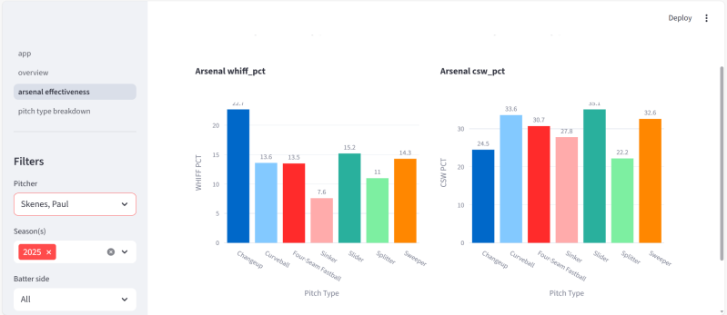
The Whiff Percentage chart compares how often each pitch in the pitcher’s arsenal generates a swing and miss. This helps identify true put-away pitches versus contact-oriented offerings.
The CSW% chart (Called Strikes + Whiffs) captures overall strike dominance by combining:
-
Called strikes
-
Swinging strikes
This metric is especially valuable for understanding which pitches consistently win counts, not just miss bats.
Using an example like Paul Skenes, these charts clearly show how his different pitch types contribute in different ways—some generating elite whiff rates, others excelling at getting ahead in the count through high CSW%.
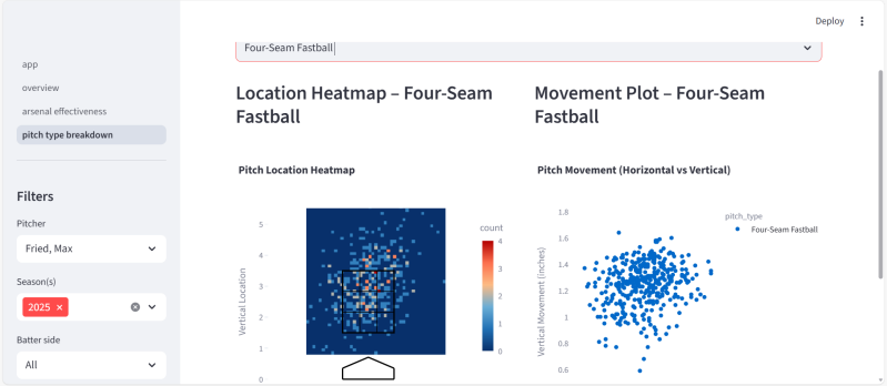
The Location Heatmap shows where the selected pitch is being thrown within and around the strike zone. Each bin represents pitch density, helping visualize command, attack zones, and tendencies. This allows users to quickly see whether a pitch is being consistently located up, down, inside, or outside, and how often it is being executed in competitive areas.
The Movement Plot displays the pitch’s horizontal and vertical break. Each dot represents a single pitch, showing the natural shape and consistency of the offering. This is especially useful for understanding:
-
How much ride or sink a fastball has
-
How tight or sweeping a breaking ball is
-
How consistent the movement profile is across an outing or season
Together, these two visuals show where the pitch goes and how it moves, which are the foundations of pitch effectiveness.
Create Your Own Website With Webador